Better camera, BUT! 🤔 Nothing Phone (2a) Review vs Phone (1)
The Phone (2a)’s a radically new design from its predecessor the Phone (1). There ARE improvements over the Phone (1) in some very important ways, but not in every way. There are some things I wish could have been better. Let’s start with what’s different this time, and then we’ll talk about camera performance, speakers, and some pros and cons.
Changes vs. Phone (1)
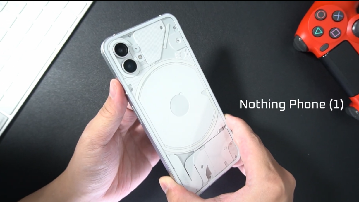
Nothing Phone (1)
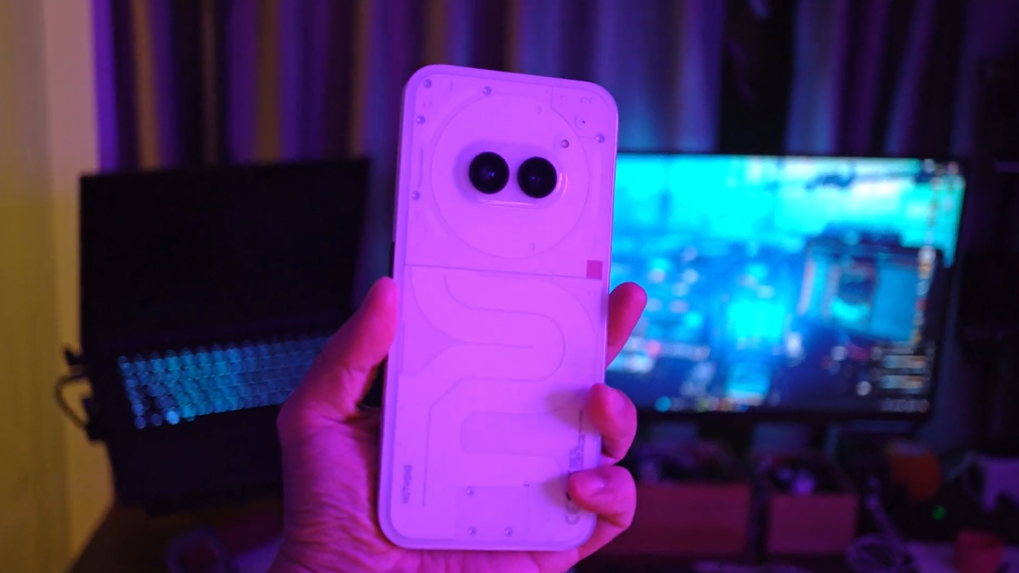
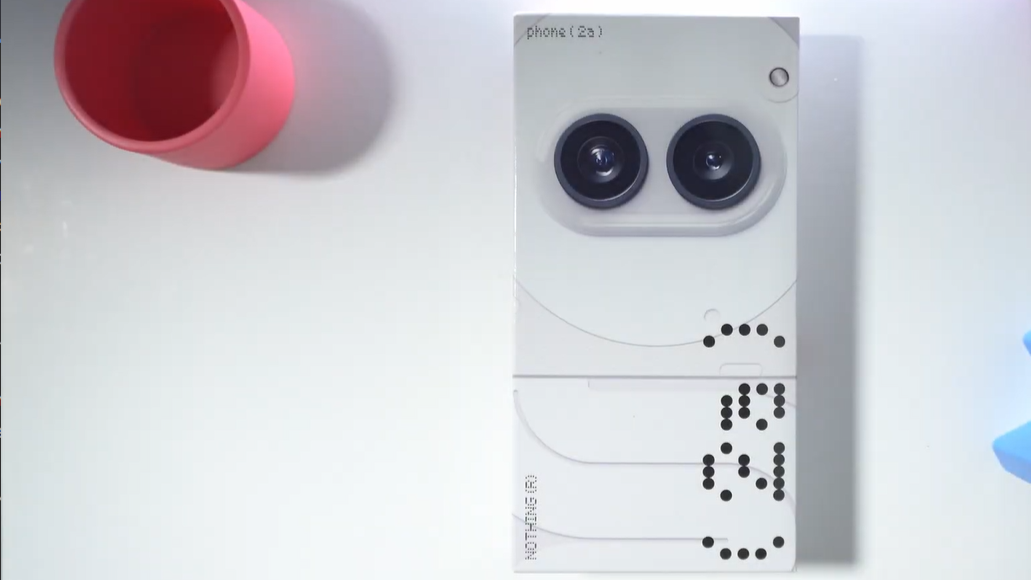
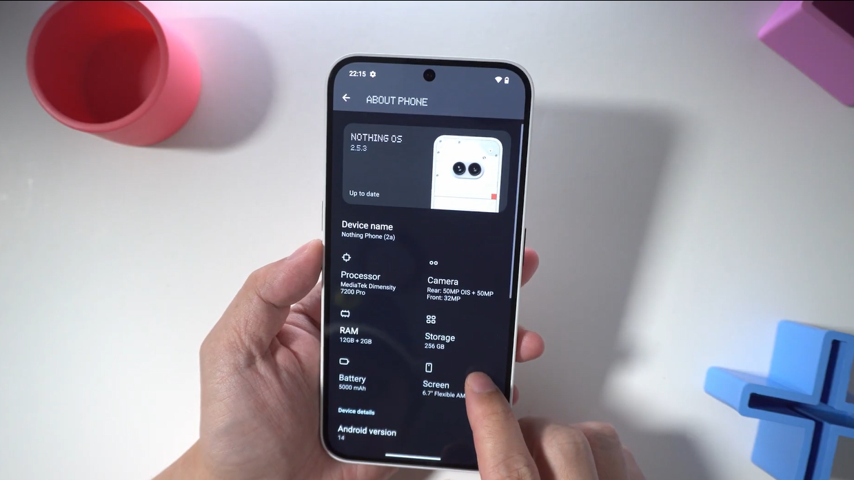
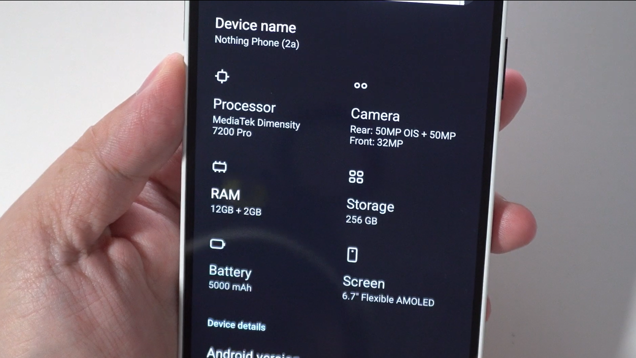
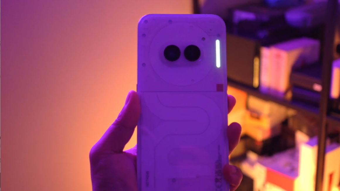
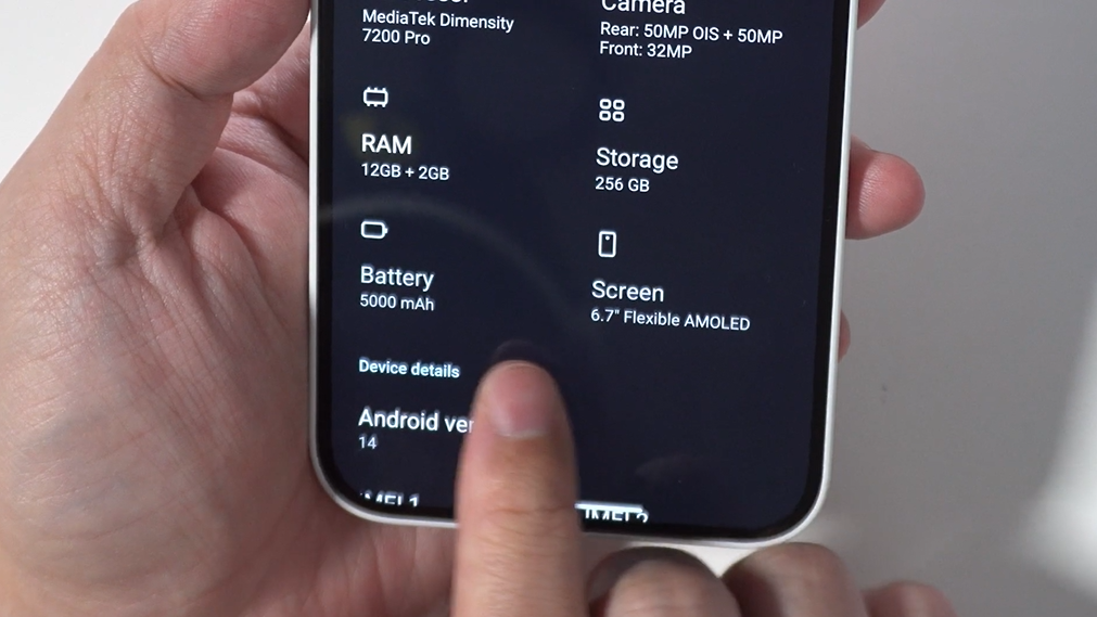
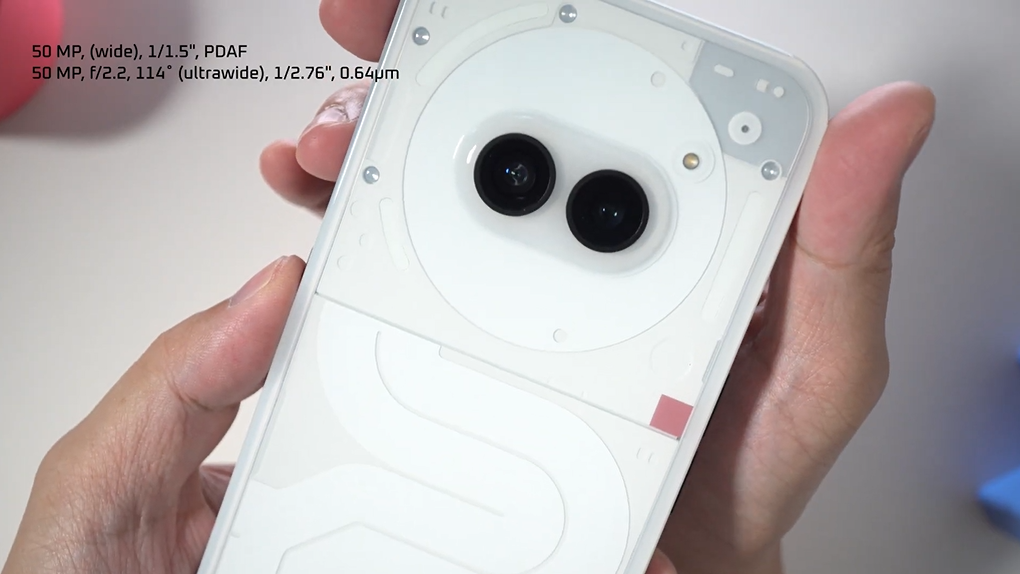
The most noticeable change is on the back panel where you can see the camera lenses are now located in the top center instead of to the left, right on top of the phone’s brains which is a new Mediatek Dimensity 7200 Pro 4nm SoC. While it still is a camera bump, this has two benefits, balancing the phone better when it’s flat on the table, and the lenses keeping away from your fingers when you’re shooting pictures and videos. I dig that.
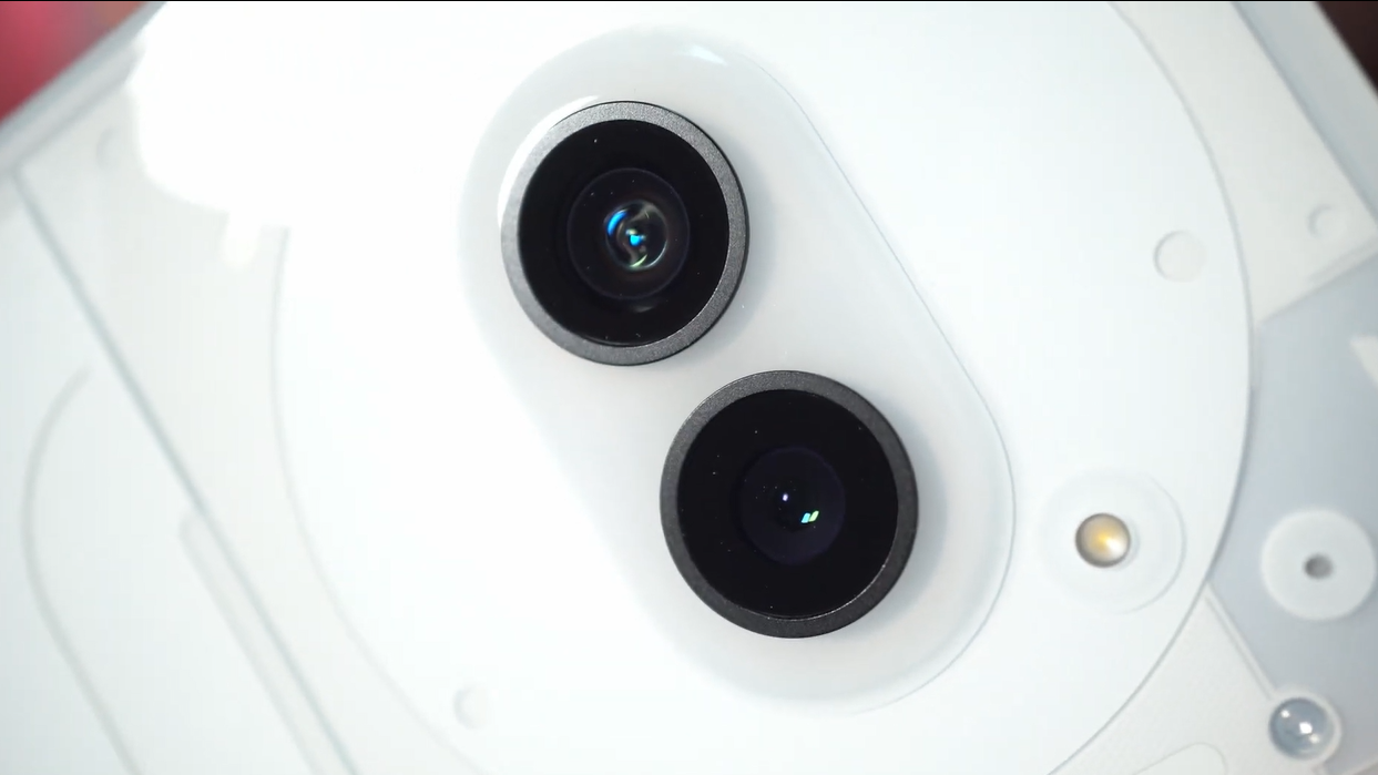
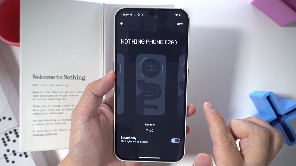
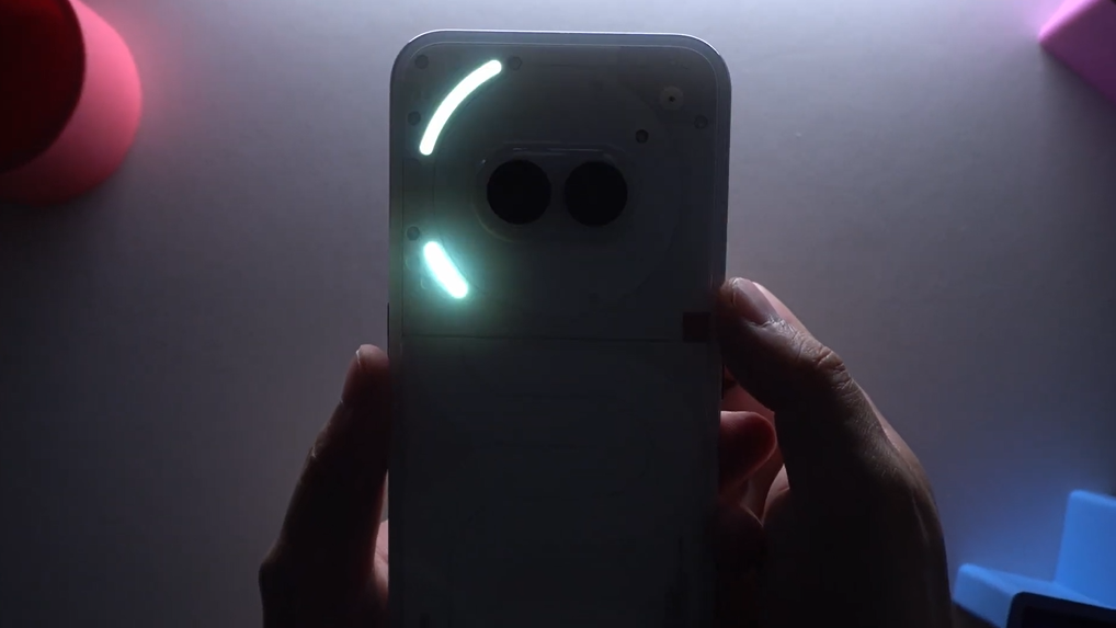
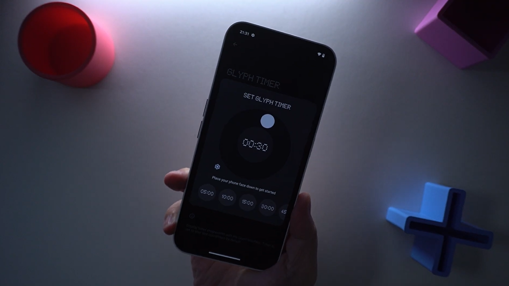
And just surrounding the lenses is a new Glyph interface that’s been simplified to just 3 glyphs surrounding the camera element. But it doesn’t mean that you’ll be giving up on certain ringtones. Many of the same ringtones that existed on the Phone (1) are still there, adapted to fit the simplified glyphs. You also get a countdown timer, and the ability for third party apps like Uber to use the countdown timer to track progress. That wasn’t available on the Phone (1) but is available on the Phone (2), and now on the Phone (2A). Watch.
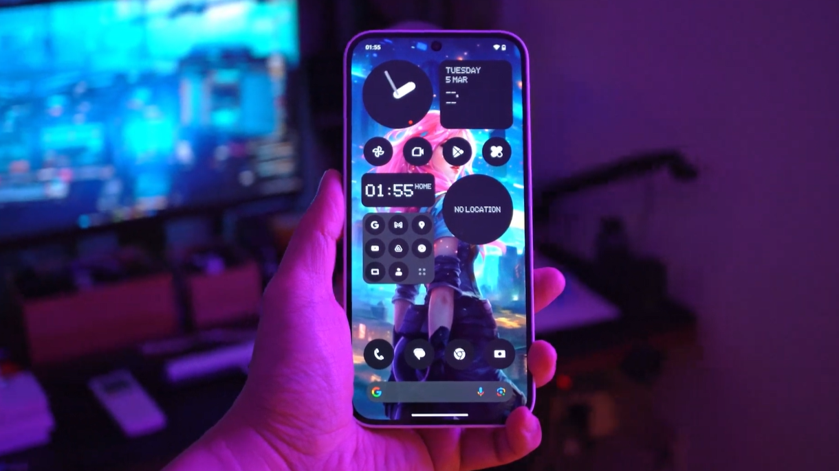
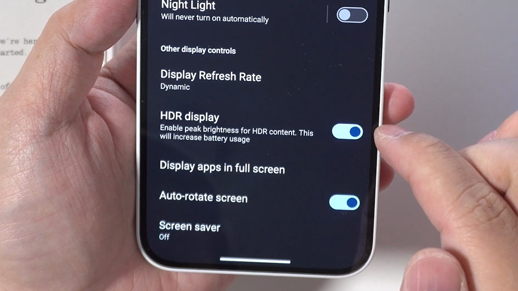
Turning our attention to the screen. This has a 6.7” FHD+ AMOLED display with variable refresh of up to 120hz, and now it’s fully capable of displaying pictures and videos shot in HDR. Watching HDR content on YouTube I was also able to get HDR’s peak brightness and contrast, but due to time constraints I have not tried it with other apps at this point.
Camera Comparison
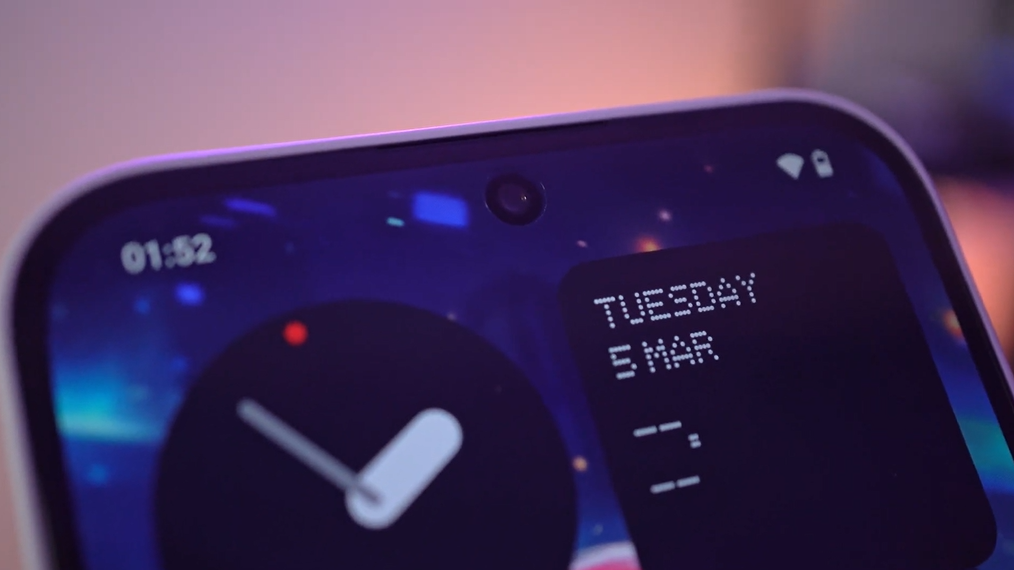
The (2a)’s camera setup is more or less similar to the Phone (1), only that its selfie camera has been upgraded to 32MP. Otherwise the rear cameras are the same 50MP for both the Wide and Ultrawide lenses, and similar to the Phone (1) you can only shoot videos in resolutions up to 4K 30fps.
When shooting pictures with the rear camera in low light conditions, the (2a) does achieve better color accuracy, because pictures shot on Phone (1) tend to have this green tinge. This does not occur on the Phone (2a). Also the scene brightness seems to be a lot more even now, with even darker areas of the shot being lifted, and in general I was getting better sharpness compared to the Phone (1). For shooting videos. I thought stabilization on the Phone (1) was alright when shooting from a stationary position, but it got pretty bad with a lot of jitter when I was just walking. Stabilization on the Phone (2a) is now much better, as you can see, there’s less jitter, but there is still room for improvement. A welcome change is that when zooming in on video mode, the (2a) will ramp in and out, rather than just switching lenses like on the Phone (1). Watch the sample video.
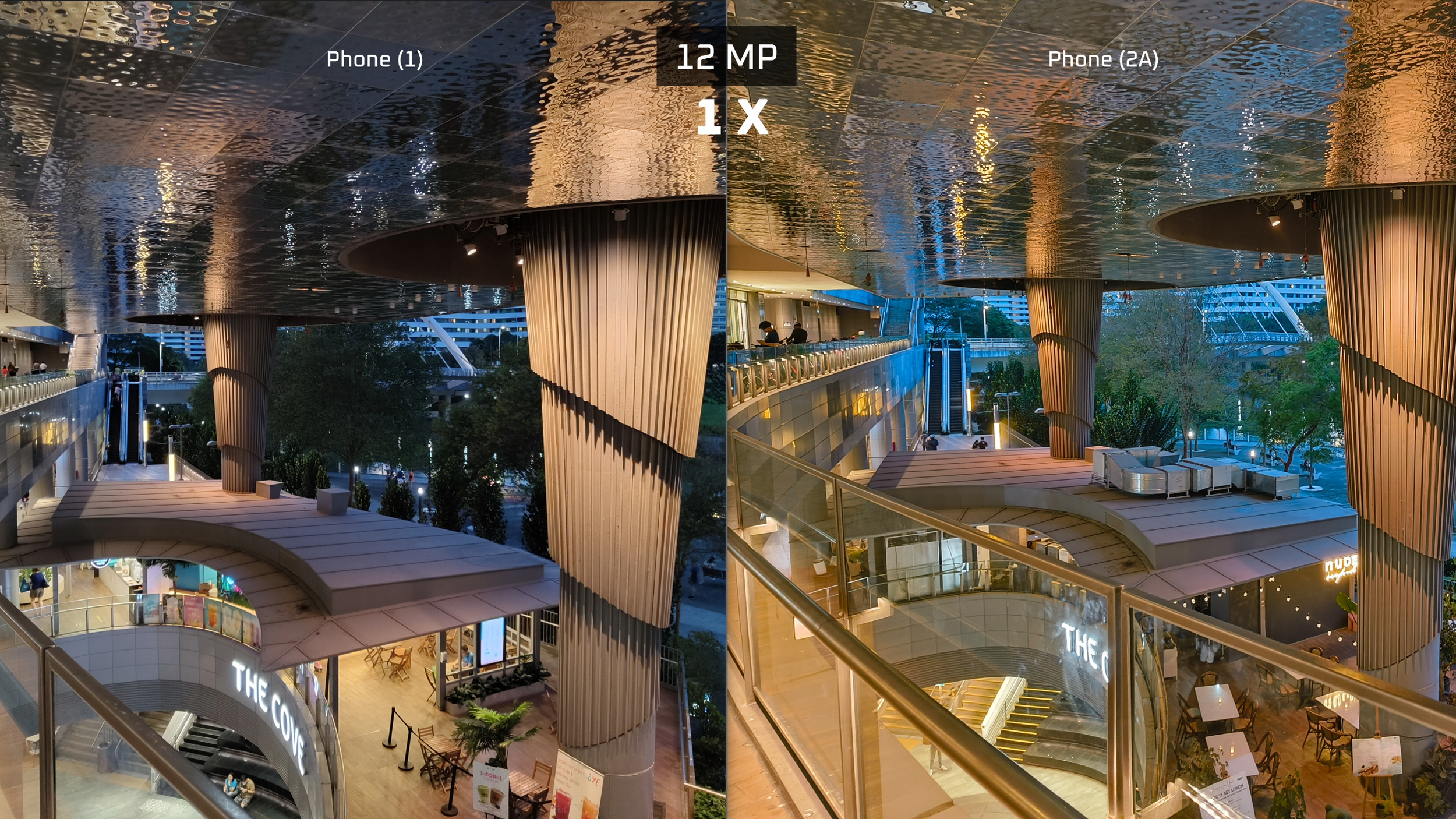
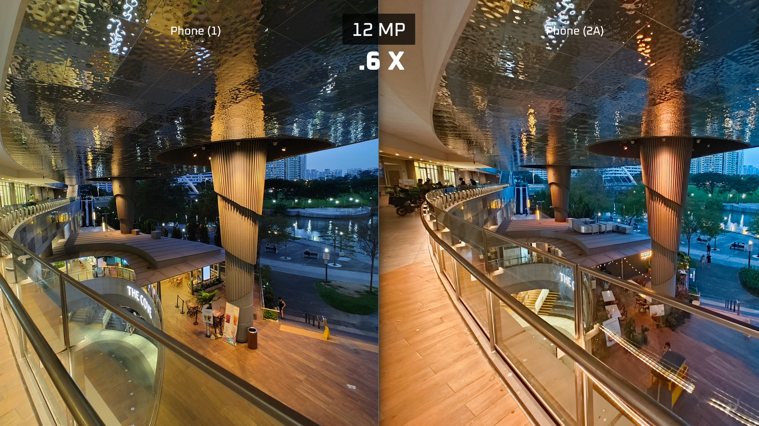
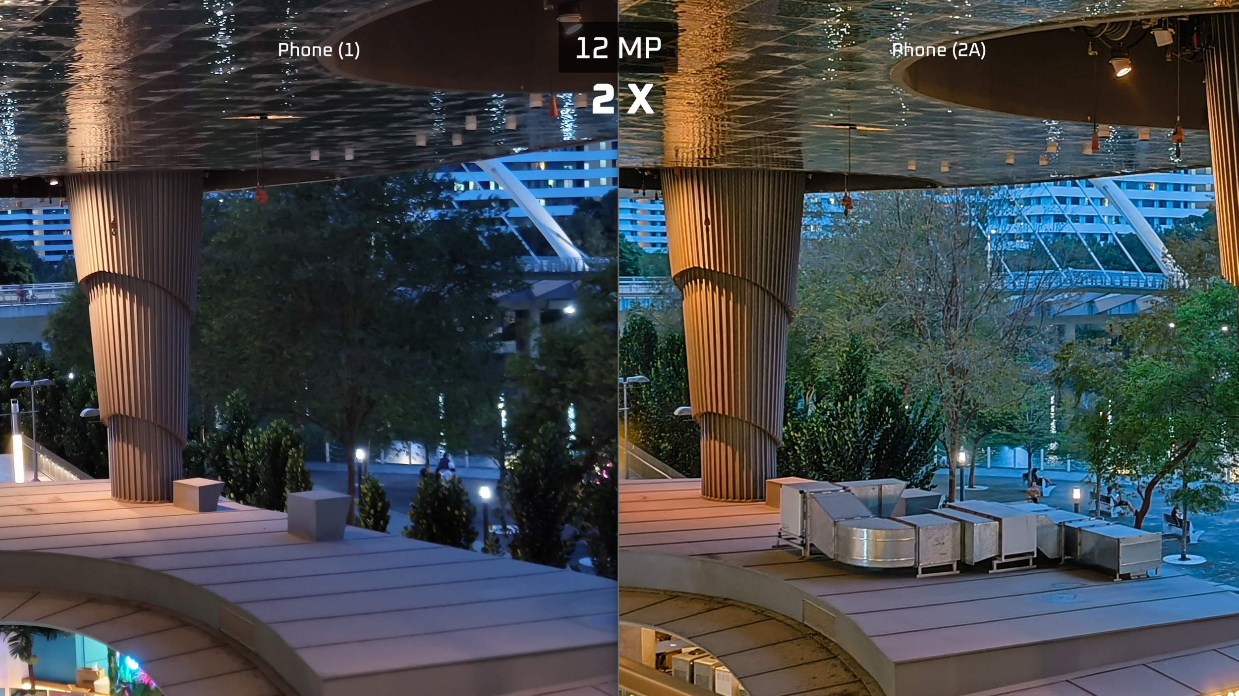
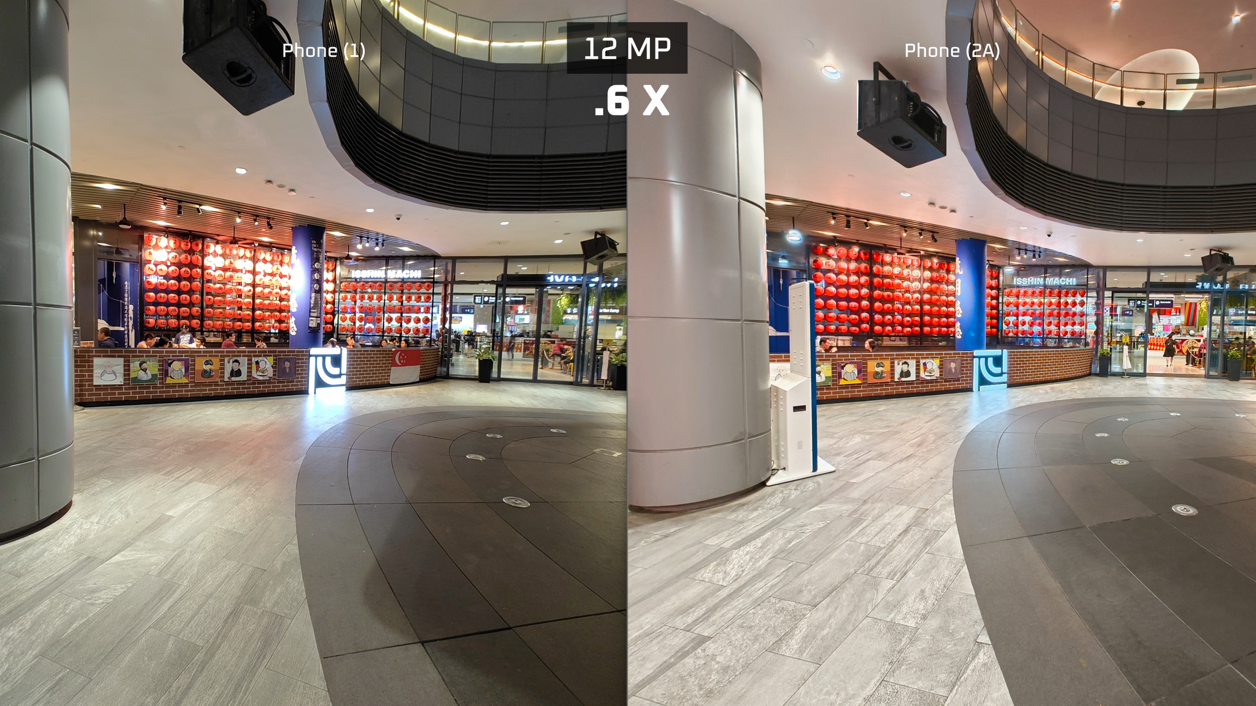
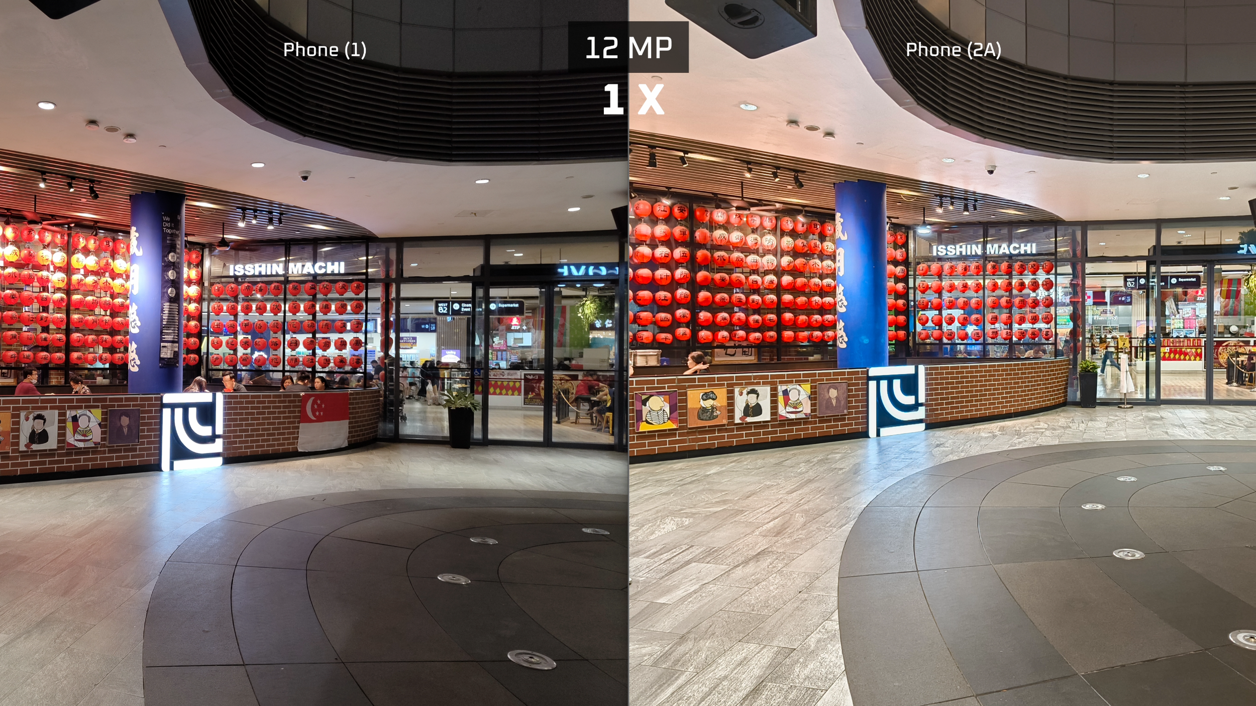
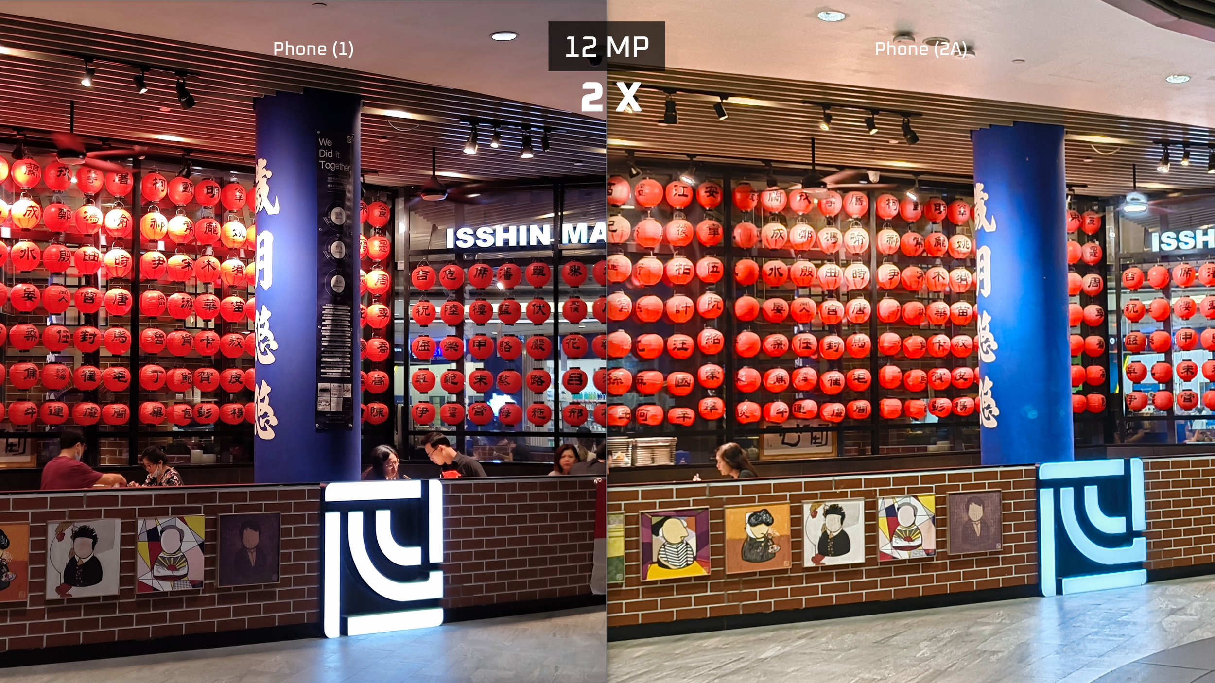
Shooting with the front selfie camera I was also getting better sharpness and more detail from its 32MP sensor, and we can see this from looking at my eyebrows.

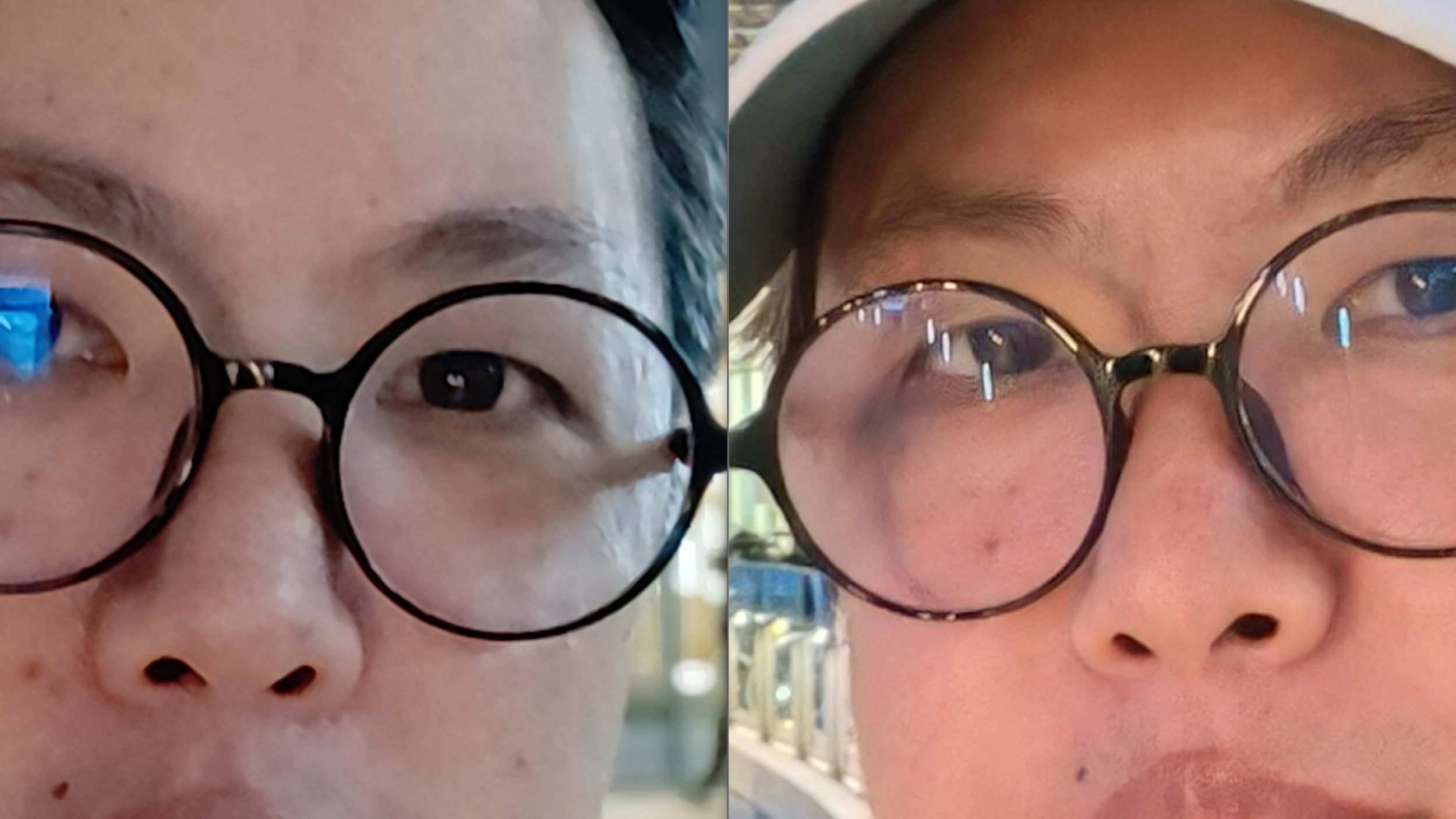
Overall, while I would say its camera quality is better, I wouldn’t say it’s a huge improvement over the Phone (1).
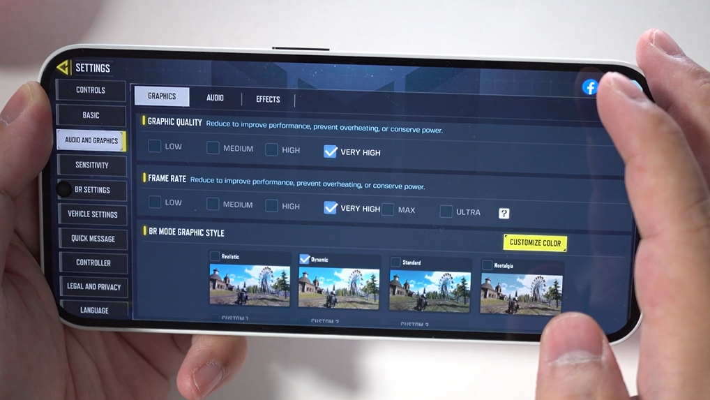
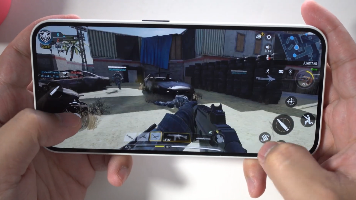
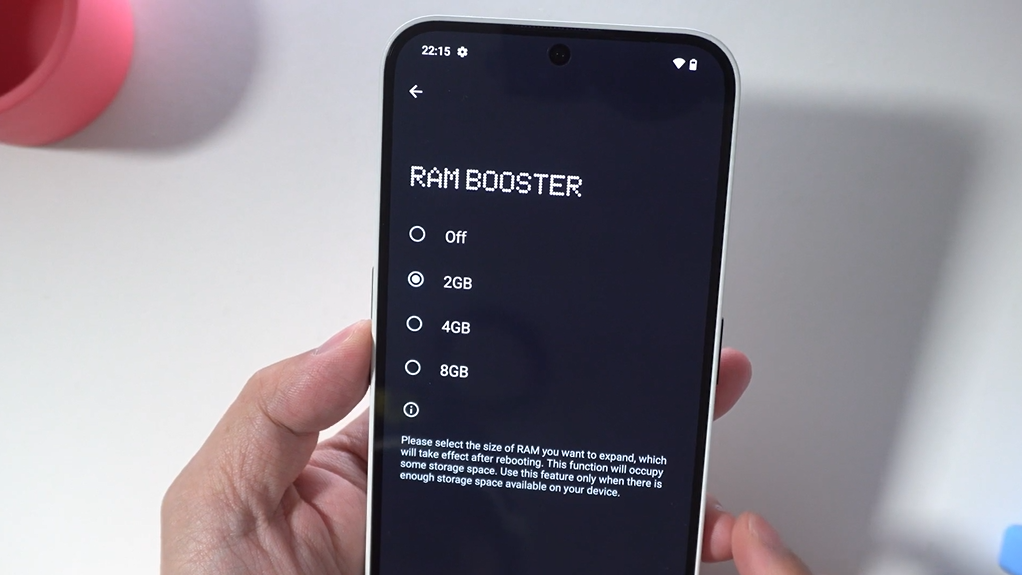
Its gaming performance is quite decent for a mid-tier device. On COD Mobile I was able to run it on “Very High” Graphic quality with “Very High” frame rate, though not at “Max” frame rate. At Max frame rate its graphic quality got kicked down to “High”, and “Ultra” frame rate kicks it down to “Low”. Those are the limitations, but on “Very High” graphic settings the game was running pretty smooth. As a fresh out of box phone it runs very smooth off its base 12GB of RAM, but if you’re running a more intensive app and it feels a little slow, you can always turn on RAM booster and stack on another 8GB of RAM. Have a look of gaming performance.
Speakers Sound Quality
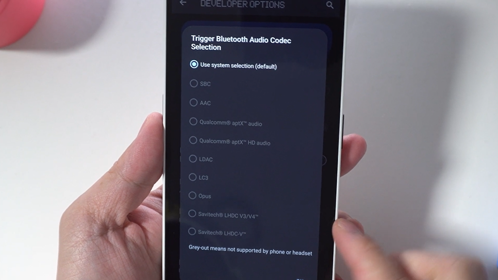
If you’re wondering about the sound of its speakers, they’re pretty average. Quite loud at max volume, but more focused in the midrange frequencies, so vocals are far more prominent than bass or highs. At max volume it can get too emphasized to the point of clipping, so it’s best enjoyed one or two clicks of volume down. I would have been able to make it sound less shouty if there was a way to adjust its EQ myself, but there’s no such way in the Phone (2a)’s settings. Also, there’s very little left right separation or soundstaging. But overall, if I’m being less fussy, it’s still quite usable for gaming, watching videos, and maybe some music. Supported audio codecs include the popular aptX HD, LDAC and LHDC that audiophiles use to stream lossless audio. Listen to the speaker’s sound sample.
In Conclusion
That was my comparison between Phone (2a) and Phone (1). To me the biggest improvements over the Phone (1) is its camera, and how the display can now show the full glory of HDR content. The camera bump’s new location is also a nice touch. Am I sad that the new Glyph Interface has been simplified? Yes and no. Yes in the sense that it’s less flashy. No, because in some ways, it is a better Glyph interface that has a countdown timer bar and third-party app access, which wasn’t featured on the Phone (1). Watch the sample.
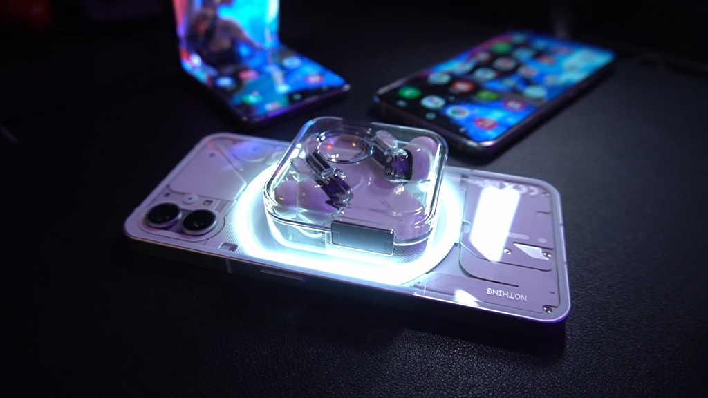
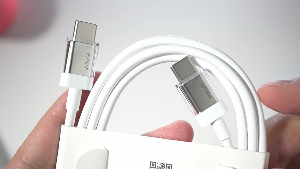
What I did wish it had is wireless charging. The Phone (1) had wireless charging and even could share power wirelessly, with the Glyph interface acting as the indicator, but not the (2a). That, to me, is a downgrade. But hey, maybe some of you are okay with that because you prefer using cable anyway, if so, the 2A’s improved camera and display should make this worth looking at.
If you’re interested and you want to check its latest price, I’ve linked to its Amazon page below.
Check latest price:
Nothing Phone (2a) - https://amzn.to/3xvMzRM
Nothing Phone (1) - https://amzn.to/3TkA2Jy
(Affiliate Links Disclosure)
When you make a purchase through the Affiliate Links on this site, the site earns a small commission at no cost to you. Thank you for your support!
